Case study · Bachelor thesis · 2021
Swift
An adaptive dashboard for semi-autonomous cars
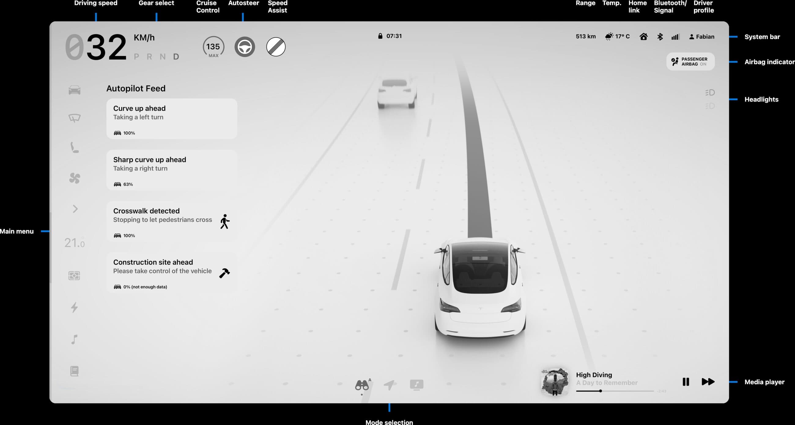
Driver assistance acts — or gives up — without ever saying why, and leaves you no way to intervene short of grabbing the wheel. Swift gives the car a voice for what it intends to do next, and the driver a way to overrule it without taking over.
- Role
- Research, UI, interaction design
- Team
- Fabian Schadt & Joshua Dessol
- Type
- Bachelor thesis, Interaction Design
- School
- HfG Schwäbisch Gmünd
- Supervisors
- Prof. Dr. Eileen Mandir, Prof. Michael Schuster
- Year
- Summer semester 2021
The brief
Design a user interface for a partially automated vehicle that makes the driver trust it.
Not a level-5 robotaxi. We parked ourselves in the awkward stage the industry is actually in — the handover zone where the car does most of the driving and the human is still responsible for all of it. The study we opened with put mass-market autonomy at 2040. The interesting design problem is the twenty years in between.
The problem
The car sees more than it says
Every research strand landed on the same complaint, and drivers put it better than we could.
“When the system emergency brakes it doesn't show on the display what it thought the threat was.”
“In the current state you have to understand how the system currently works and be able to anticipate its reaction.”
“There is no warning ahead of sections of the road where the car is unable to perform on its own.”
Tesla owners, from our survey of 46 free-text responses
No explanation
The car brakes. Nothing on screen accounts for it — 80% of the owners we surveyed had experienced phantom braking.
No forecast
Nothing tells you which parts of the route it can handle until you're already in them.
No say
The only intervention available is total takeover. An all-or-nothing switch, in a situation that is rarely all or nothing.
The result is lopsided: the car perceives far more than it shows, so the driver ends up trusting it less than the hardware deserves.
How we got there
Research
Six months, starting wide and narrowing to a single question: what does the car know that the driver doesn't?
Be your own customer
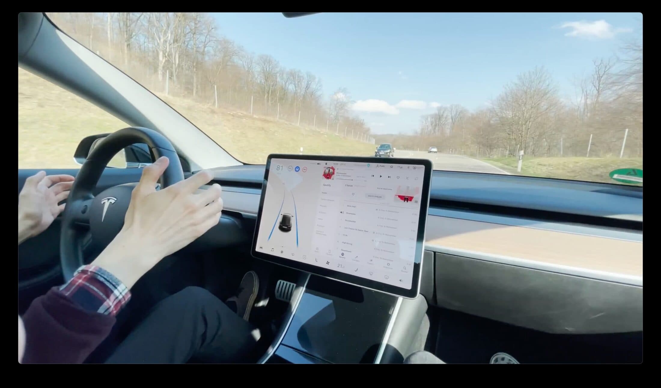
Neither of us had lived with an assistance system, so we rented a Tesla Model 3 Performance for a day. We enjoyed it and felt safe — right up until the first phantom brake.
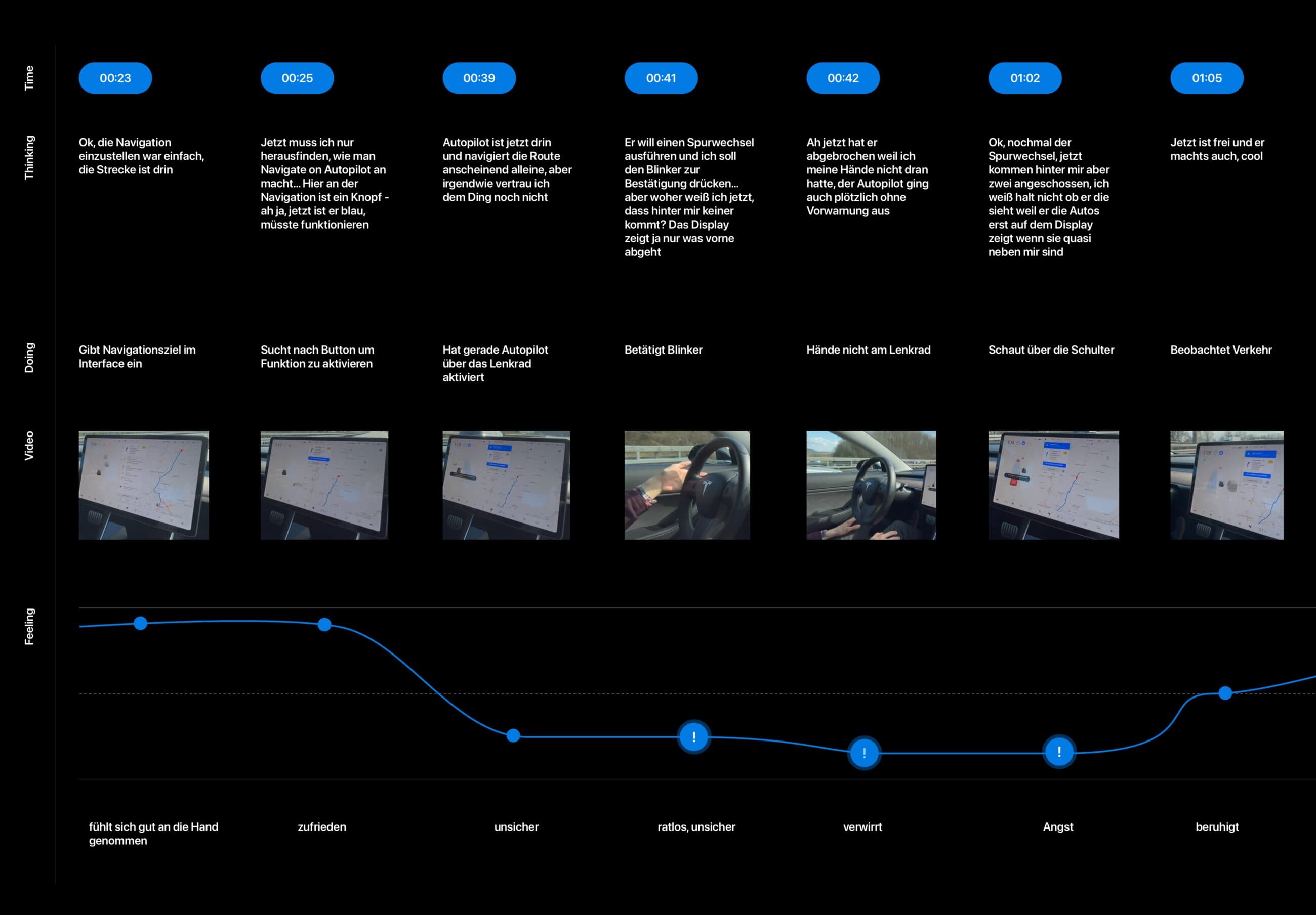
Interaction journey map
The same drive, structured. Fabian drove, Joshua observed and filmed. Thoughts, actions and emotion plotted against time, every touchpoint marked positive or negative.
Owner survey
20 open questions posted to r/teslamotors — free text, no multiple choice, so nobody could pick our answer for us. 46 responses.
Object detection
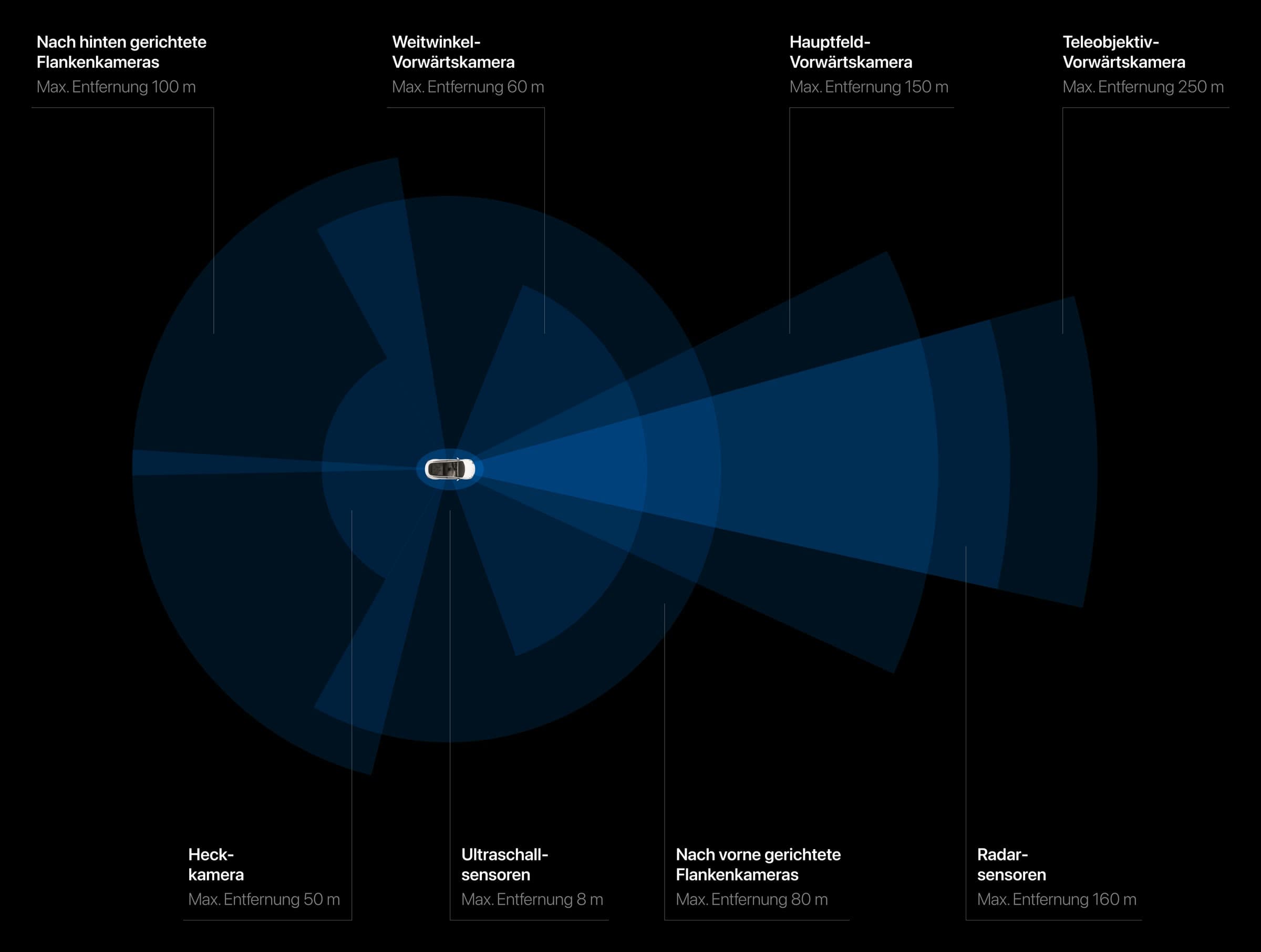
A GoPro on the car, every frame run through ImageAI. Then a second GoPro on the driver's head, to compare the two viewpoints directly.
Design sprint
A full sprint to open the solution space, defined around trust, control and representation — and to decide what we were not going to build.
Competitive SWOT
Consumer Reports' 2020 ranking of 17 assistance systems, read for the gap between how well a system drives and how well it explains itself.
What we learned
The design sprint turned a lot of research into a short list. Everything Swift does traces back to one of these.
- The driver has to be able to trust the system.
- Complex information has to be made legible, not just displayed.
- The driver needs a way to decide when the system is unsure.
- Eyes stay on the road.
- A handover is announced early, never acted out abruptly.
- Every action the car takes must be traceable afterwards.
Ideation
Getting it wrong first
Four MVPs, tested with three fellow students. What failed shaped the final system more than what worked.
The dock in the bottom-left corner
Unreachable while driving. Obvious in hindsight, invisible on a desk.
A live camera feed of the road
Too detailed, and rendered from an angle you'd never see your own car from. Worse, it showed the driver what was already out of the windscreen — a redundant double coding. This killed the raw-camera direction for good.
A confidence percentage
Nobody understood what the number measured, or the icon next to it. It survived as colour instead.
The log book
Nobody realised it existed or how to open it. It got a permanent home in the dock.
Where to put the camera
Bird's-eye visualises a route well. Top-down shrinks buildings and distorts distance, so we dropped it. Third person — fixed, behind and slightly above — won: the driver reads it as their car, and it matches a pattern people already know from games.
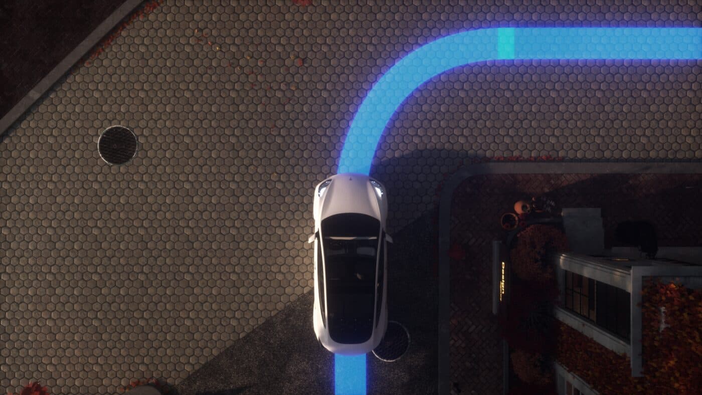
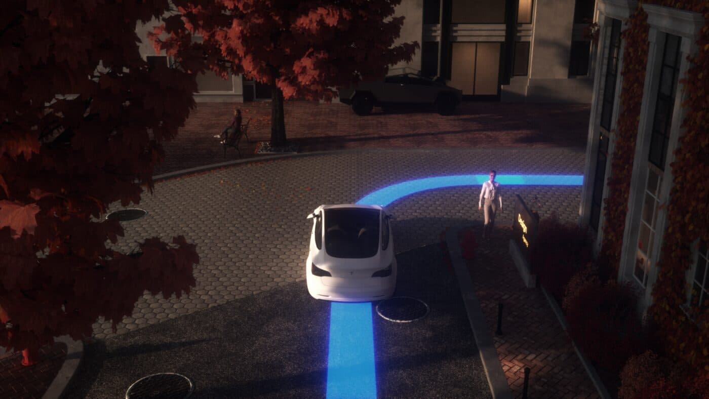
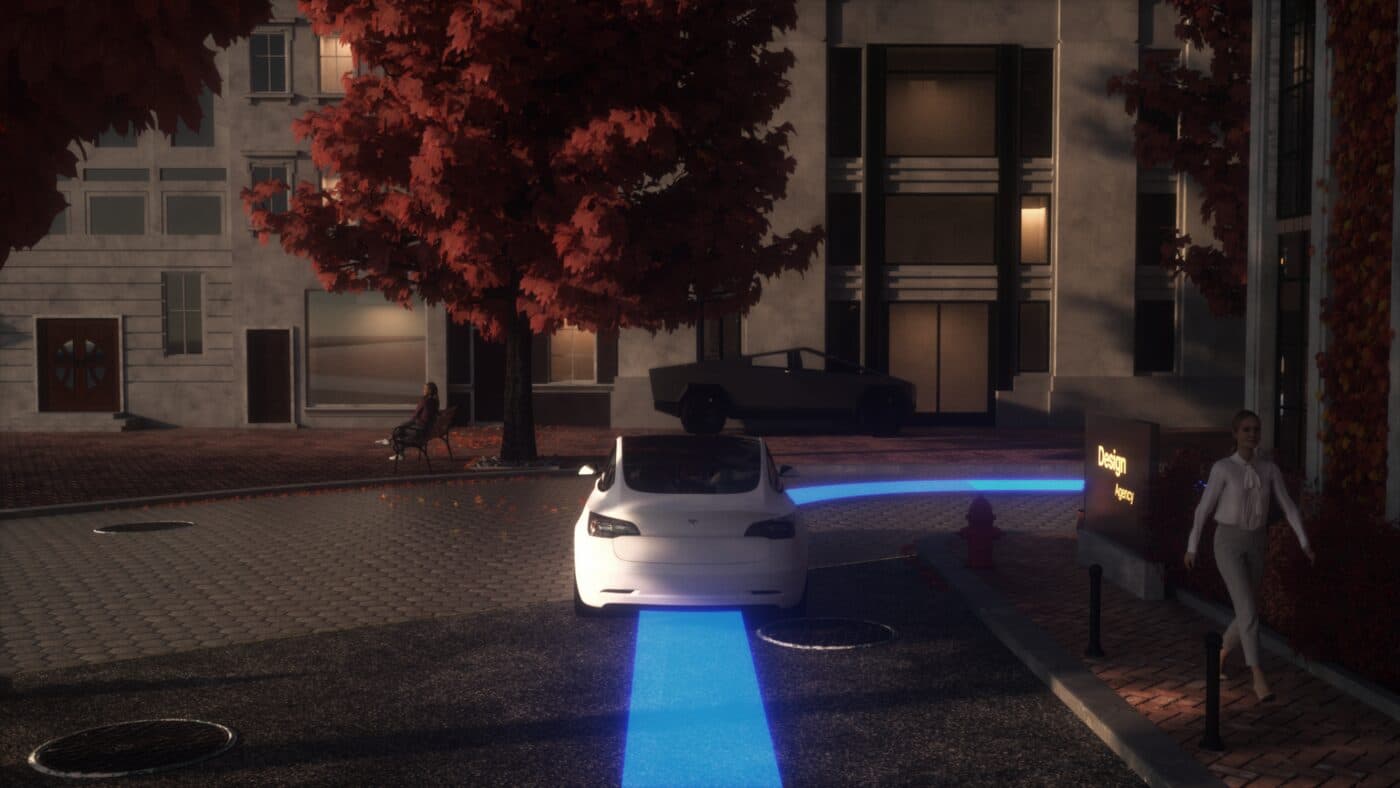
The turning point was translucency
Early layouts used a solid white dock and a solid menu bar, and every screen felt boxed in. Making the panels frosted let objects and movement stay visible behind the controls. In a context this dynamic, showing everything is itself a trust device — and it moved the whole system from framed to open.
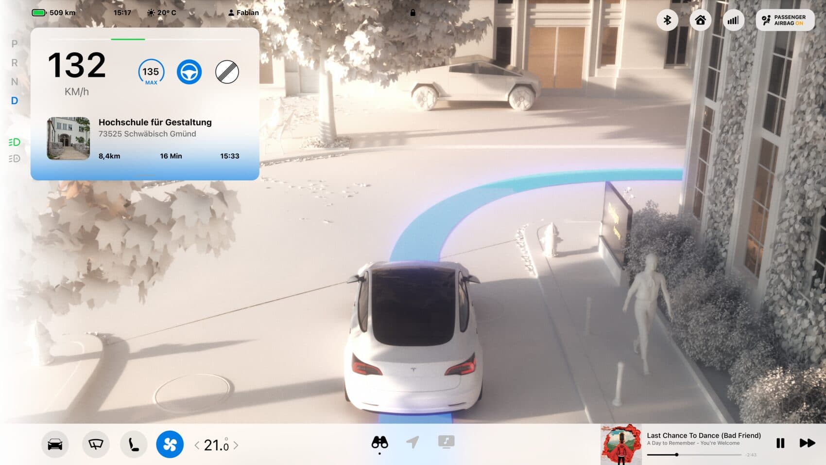
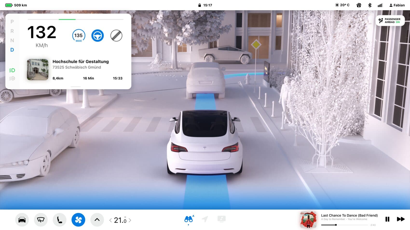
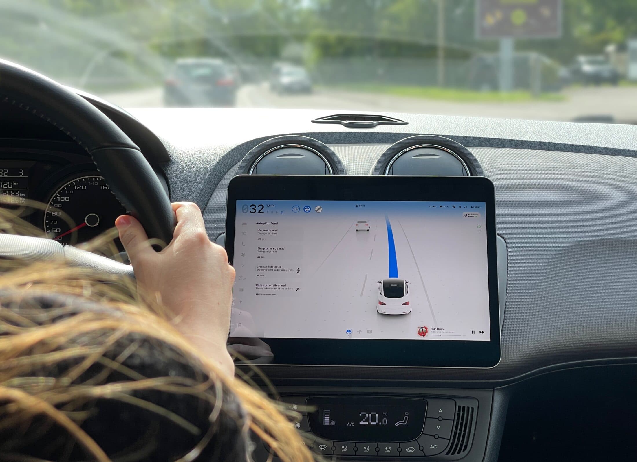
The greeting, the tiles and the detail views tested well. Sizes and proportions tested well. The icons did not — which is exactly why they ended up with their own plate in the styleguide.
The outcome
The system
The driver should be able to do the thing they came to do with as little effort and distraction as possible. In a car, that sentence is a safety requirement.
Getting in
The car already knows where you're going.
A welcome screen greets you by name and hands over after a few seconds. It exists because its absence was conspicuous during our own test drive — nothing about getting into the car acknowledged that a person had arrived.
Then suggestions, built from past behaviour: the commute it knows you take at this hour, the temperature at your destination on arrival, charge before and after, and a forecast of how the autopilot expects to behave along the way. Accept it, adjust it, or throw it away.
Availability
Where it can drive itself — and why it can't elsewhere.
This is the most direct answer to the research. The route is broken into stretches, each marked with whether the system can handle it. Roadworks get a roadworks symbol. City streets get a city-streets note.
Cruise-control speed, the observation setting and the autopilot switch all live in the same view, so the decision and the controls are never more than a glance apart.
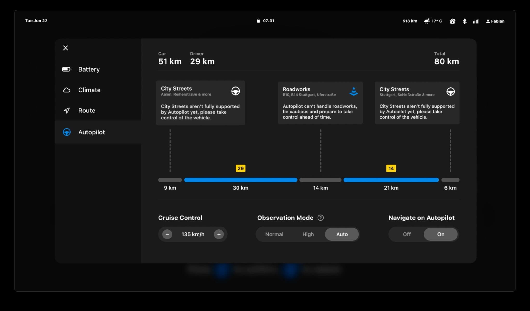
The Autopilot Feed
A queue of what the car intends to do next.
The most-requested feature in every interview and the survey was some form of predictability. The feed is that: the upcoming manoeuvres, in order, each coloured by how confident the car is that it can manage it alone.
Confidence is derived from map data and other drivers' cloud data, so you see how closely you need to watch the road before the situation arrives rather than during it. The percentage we first tried didn't read at a glance — colour does.
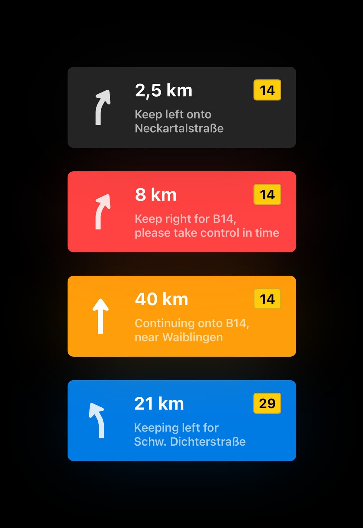
- Grey
- You're driving.
- Red
- It can't do this stretch — but you can teach it.
- Orange
- Unsure. It will attempt it, and warn you in time.
- Blue
- It has this.
Object detection
It acts first, then explains itself — while it's still acting.
At speed on a dual carriageway, the car detects an unknown object ahead. Without any input it checks whether the adjacent lane is clear, finds that it is, and changes lane. An emergency stop at speed avoided.
The part that matters for trust is what happens in the cabin at the same moment: the cockpit is told what the object was and why the car moved, as it moves.
Teaching
For the stretches marked red.
The feed warns that a section is coming up the autopilot can't manage. Instead of only handing control back, the driver can offer to teach it: recording starts, they drive the section themselves, and the route data goes back into the fleet.
Driving it yourself stays available at any point. Finishing a teaching run earns reward points — the thesis suggests charging credit.
Intervention
Influence the situation without taking over.
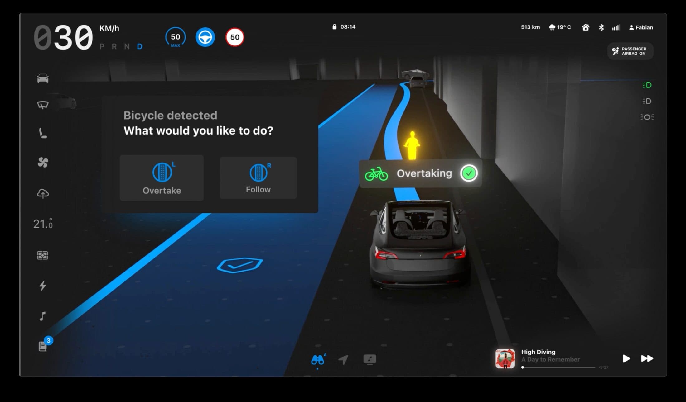
A cyclist is registered in the car's lane. The system checks that both options are genuinely possible, then offers them: follow at an adjusted speed, or overtake. Whichever you pick, the autopilot keeps driving.
A second case — a pedestrian crossing the autopilot is unsure about — works the same way. The design goal was explicit: never let the car sit in a decision loop that a human can resolve in one tap.
Notifications & the log book
The loop closes after you've parked.
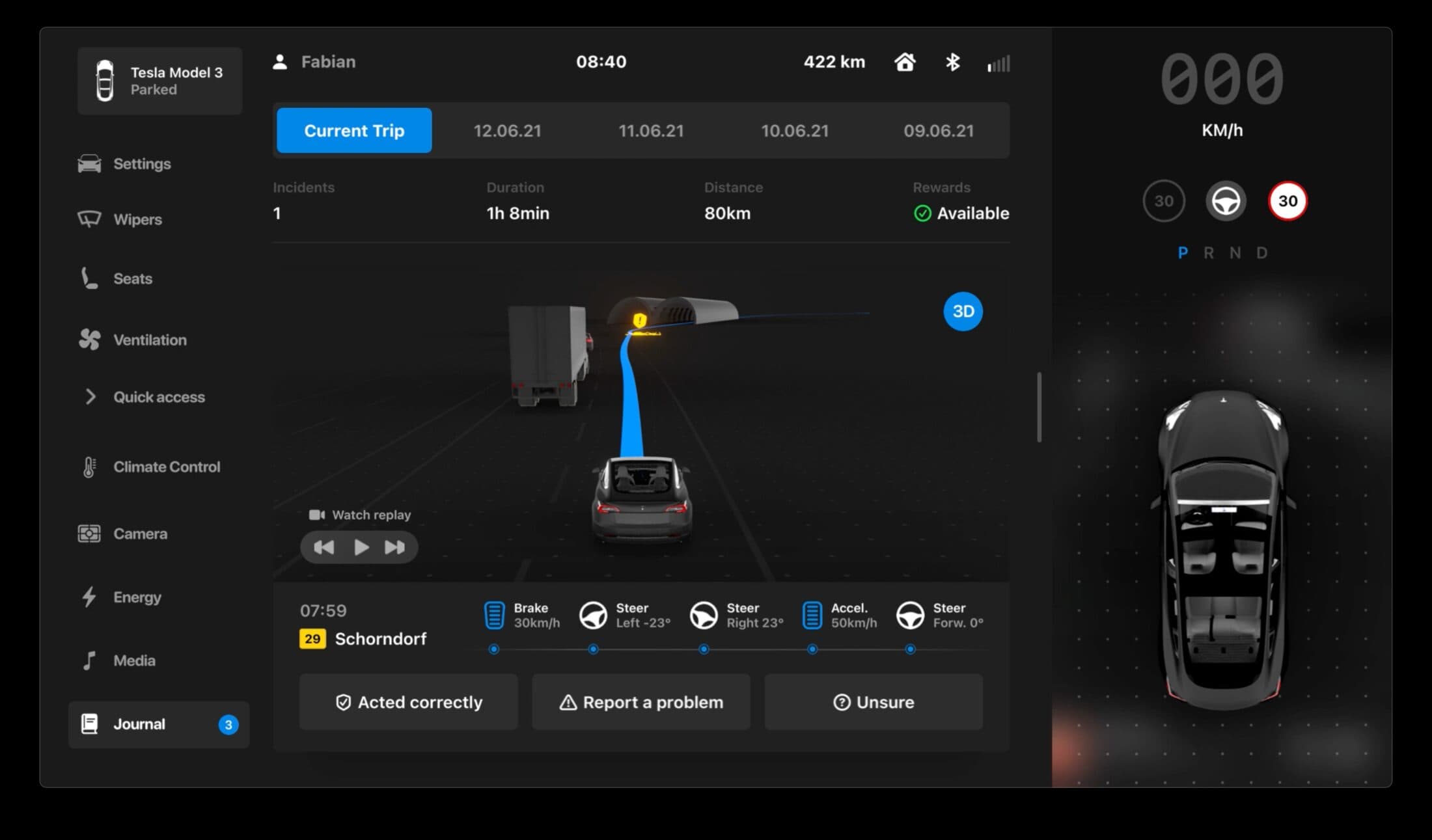
Our survey asked for this one almost verbatim: a written or video log, because reading things in real time means staring at the screen instead of the road. Notifications hold the history; tapping one jumps to the event.
In the Journal you get the incident in full — how many happened on the trip, how long it took, how far it went, and a replay of the footage. Then you answer: acted correctly, report a problem, or unsure.
That answer improves the system, is shared anonymously with the manufacturer and other drivers, and earns a reward. The car explains itself, the driver judges it, and both get better.
What we cut
Observation Mode
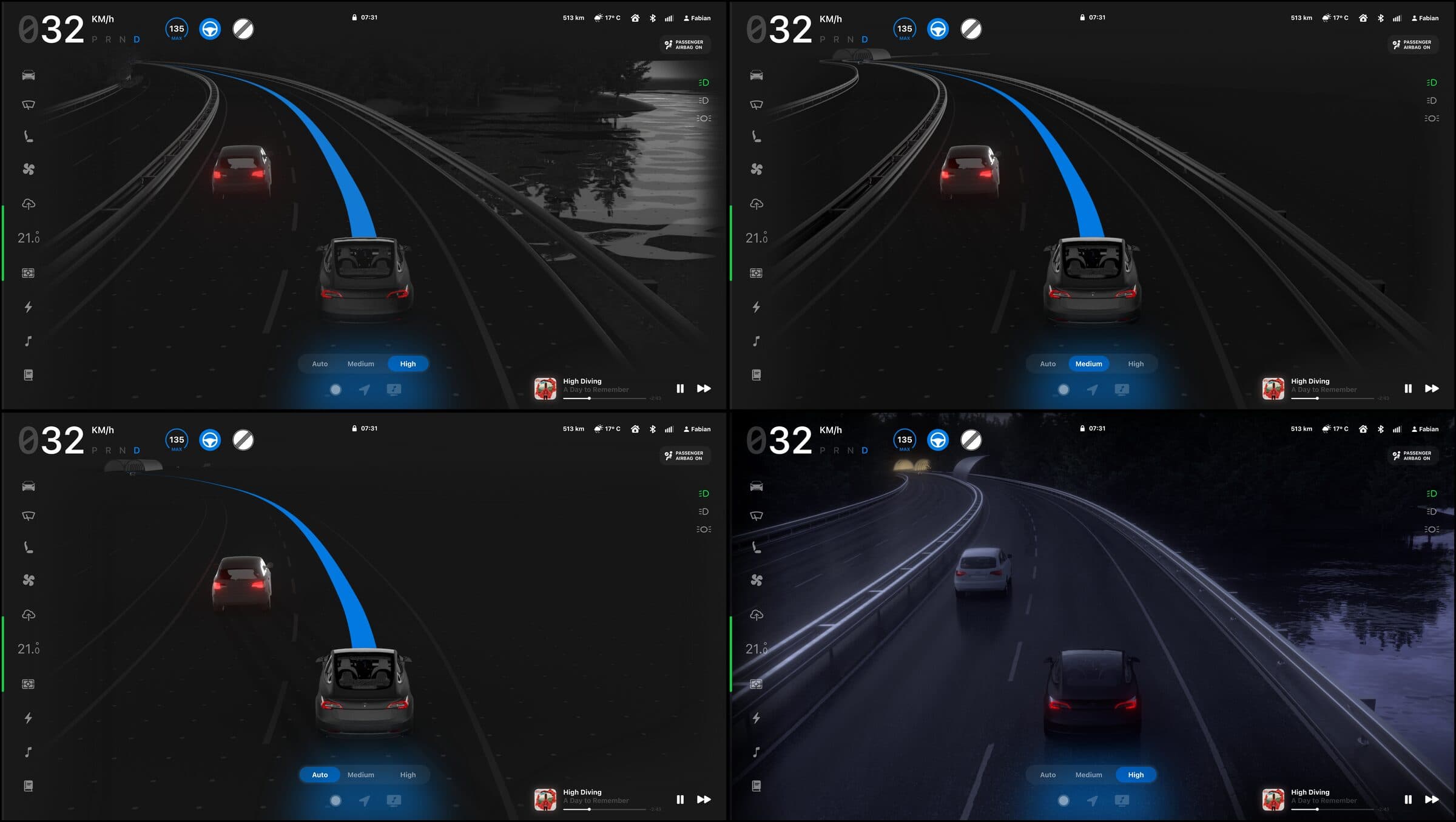
A control for how much of the surroundings the car draws. Off. Normal — a realistic reading of live and cloud data, with the driver holding responsibility because calculated accuracy sits under 50%. High — everything it collects, drawn at all times. Auto — it hides the lot once other drivers' data shows the section is trouble-free.
It tested well and testers liked it. We cut it anyway: the idea leaned too far into speculative design, and the technical basis for it doesn't exist yet. It's here because a case study that only shows the parts that worked isn't a case study.
Design language
Near-black ground, one confident blue, and frosted panels so movement is never fully hidden behind a control.
Eerie Black
Ground
#191919
Eerie Black
Surface
#1D1D1D
Azure
Primary
#007BE4
Orange Peel
Caution
#FF9E0B
Tart Orange
Alert
#FF3B30
White
Text, at 100 / 50 / 20 / 5%
#FFFFFF
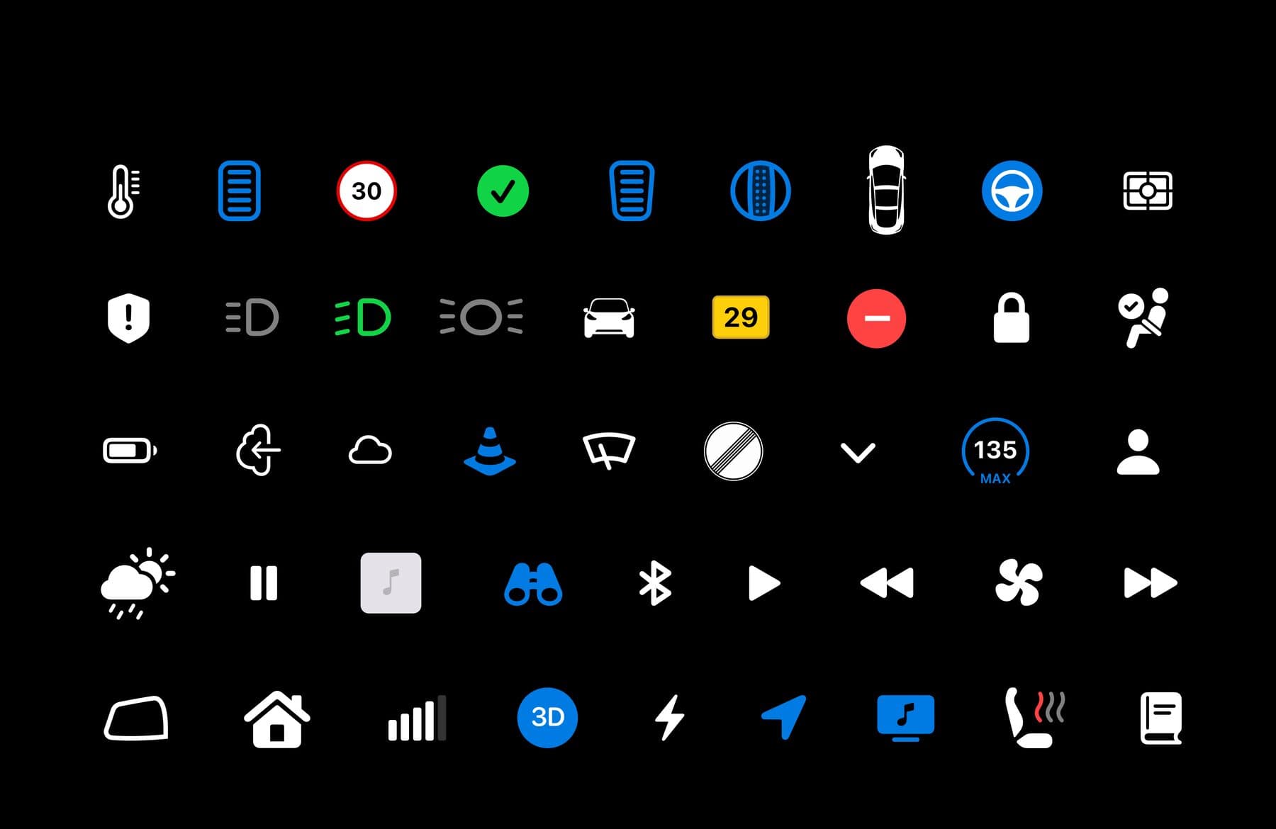
The testing round flagged icons as the weakest link in the interface, so they got their own pass and their own plate in the styleguide.
Outcome
A complete UI system for a partially automated car, plus rendered use-case films — the interface composited into 3D scenes so each scenario could be judged in motion and in context rather than as a still.
Submitted in July 2021 and shown in HfG Schwäbisch Gmünd's digital exhibition.
- Design & research
- Fabian Schadt, Joshua Dessol
- Supervisors
- Prof. Dr. Eileen Mandir, Prof. Michael Schuster
- Vehicle access
- Itana GmbH, Stuttgart
- Industry interview
- amplify design GmbH
Images and films are from the original thesis documentation. Some diagrams are still captioned in German — it was written and submitted in German.