Case study · Pre-thesis project · 2021
Praesenti
A pocket coach for public speaking
Losing the thread mid-sentence with a room watching is a feeling almost everyone has had, and almost nobody is taught their way out of. Praesenti treats presenting as a skill you practise — not a nerve you either have or you don't.
- Role
- Concept, research, UI & interaction design, 3D
- Team
- Fabian Schadt, Annika Schiefer, Joshua Dessol
- Type
- Probebachelor, Interaction Design
- School
- HfG Schwäbisch Gmünd
- Supervisors
- Prof. Hans Krämer, Prof. Jens Döring
- Term
- Winter semester 2020/21
The brief we set ourselves
How might we support young adults — give them the tools and the confidence to make communication land?
Note what that is not: it says nothing about presenting. Presenting is where we arrived after four iterations, not where we started. The project began with conflict, and the honest version of this case study is the route rather than the destination.
The problem
Everybody communicates. Almost nobody was taught how.
Interviews in every round, with 18- to 28-year-olds, and the same shape kept appearing: people knew exactly what they wanted to say, and said nothing.
“Sometimes I don't know what to say, so I'd rather say nothing.”
“I'd have things I could say — but I know I'd forget them in exactly that moment.”
“It takes so much effort, even though nothing bad can actually happen.”
From our interviews, October 2020
No knowledge
The methods exist and are well documented. Reading them changes nothing on its own — people told us they knew the theory and had still never used it.
No practice
There is no safe place to rehearse. As one participant put it, you don't practise this in your next argument.
No confidence
Situations that might turn uncomfortable get avoided or postponed — which removes the very repetition that would build the confidence.
Affinity-mapping every scenario we had collected left exactly those three. They stayed the frame for the rest of the project, even after the subject changed.
How we got there
Five iterations to find the question
Each round opened with its own how-might-we, ran research → define → ideate → prototype → test, and closed by naming what it had got wrong. The scope narrowed every time.
Conflict and nonviolent communication
Can software help young adults reflect on a conflict and practise nonviolent communication?
We posed as a chatbot over WhatsApp — Wizard of Oz — asking the same four Rosenberg questions every time, then asked people to record themselves saying the thing for real.
Guided reflection works. Filming yourself does not: it was a wall for almost everyone, and the step into reality was missing entirely.
Needs, values and masks
How do we define the problem, and which mechanisms actually support people?
Conversations held over FaceTime and Itsme with both people appearing as animoji, to see what a mask does to a conversation.
Talking to an animoji did not feel strange — it stays far enough from a real body to avoid the uncanny valley, and the anonymity visibly helped people come out of their shell. But micro-expressions and body language were gone.
Improv behind a mask
Can improv techniques with a covered face build communication and confidence?
A workshop run over FaceTime and WhatsApp with one of us moderating, working through listening, quick-wittedness and status-switching exercises.
The exercises worked; the instructions did not. Participants didn't understand the tasks, or why they had a mask at all. Onboarding stopped being a detail and became a requirement.
Working Out Loud
What knowledge and skills do people need, and which mechanics deliver them?
A weekly circle where a group works on individual communication goals together, moderated by the software. Tested on a shared Miro canvas over FaceTime.
The audience has no appetite for a fixed weekly appointment, and no set of exercises serves everyone when everyone's goal is different. You can't swat every fly with one swatter.
Presenting
How do we make communication done well measurable?
We stopped trying to teach communication and picked the part of it that can actually be observed, scored and practised alone.
Posture, delivery and phrasing. Presenting was never the idea — it was the slice that survived four rounds of narrowing.
What the research settled
Everything the app does traces back to one of these.
- Guidance is what turns knowing into doing.
- People will not watch or listen to themselves — abstract the feedback.
- An exercise nobody understands is an exercise nobody finishes.
- Practice has to fit into gaps, not into calendars.
- Feedback must stay human, never a sudden 1-of-5 stars.
- Every exercise has to tell the user why they're doing it.
The idea that carried over
Mirror neurons became the theoretical hinge. We imitate whoever is in front of us: a speaker breathing shallowly from stage fright makes the room breathe shallowly too, and a face with too little expression activates too few mirror neurons, so what's said becomes hard to read and the audience feels uneasy. That is why Praesenti trains delivery and body rather than script — the parts the audience catches without noticing.
The product
The system
An initial recorded answer to one easy question sets the baseline. From it the app builds a training plan of five- to ten-minute exercises, each one small enough to do in a gap in the day.
Onboarding
The first thing it asks for is your voice.
Name, then which of four skills you want to improve, then a short test: one small, general, easy question, answered using the recording function. That recording is what defines the roadmap for everything after — so the app has heard you before it advises you.
The onboarding got this much weight because iteration 3 proved what happens without it. An exercise whose purpose isn't clear doesn't just confuse people, it destroys their motivation to finish.
Home and Journey
Progress you can see from across the room.
Home carries new courses, the training plan and recent progress. Journey carries the level — raised by finishing exercises, which unlocks further ones — with progress broken down by category underneath.
Gamification was researched rather than bolted on: Bartle's four player types, so all of them get something; Csikszentmihalyi's flow, so the challenge tracks ability; and indirect control, because the feeling of choosing freely is what separates a game from a chore.
Monument Valley was the reference for showing continuous progress, but a whole map in a game engine was more than we needed. Plateaus were the answer — stepping stones the fox walks along, ending at mastery.
Pauses
A pause before the key sentence is the cheapest emphasis there is.
Speakers rattle through. The exercise hands you a transcript and a limited number of pause bubbles — capped at the number of pauses that actually make sense — and asks you to drag them where you think the speaker should breathe.
The evaluation scores three separate things: the pause placed correctly, the pause placed wrongly, and the pause that should have been there and wasn't. Individual passages of the original speech can be replayed to compare against.
Dynamics
Speak flat for long enough and the room stops listening.
First you imitate: listen to a speaker, then say it back with live feedback on how close you are. Then you compose. A speech you wrote yourself gets a dynamics curve — say the sentence aloud, then drag the handle above each syllable up or down. Holding a handle turns its syllable blue, so the feedback is immediate.
Crescendo and decrescendo are drawn with a finger across the text. The gradient always runs weak to strong from where the finger lands, which means a decrescendo is simply the same gesture right to left.
This screen is where the dark mode was decided. Testing showed the text is far easier to follow when it doesn't move — so it sits still and rotates — and far easier to read against near-black, exactly like a teleprompter.
Posture
Your body says it before you do.
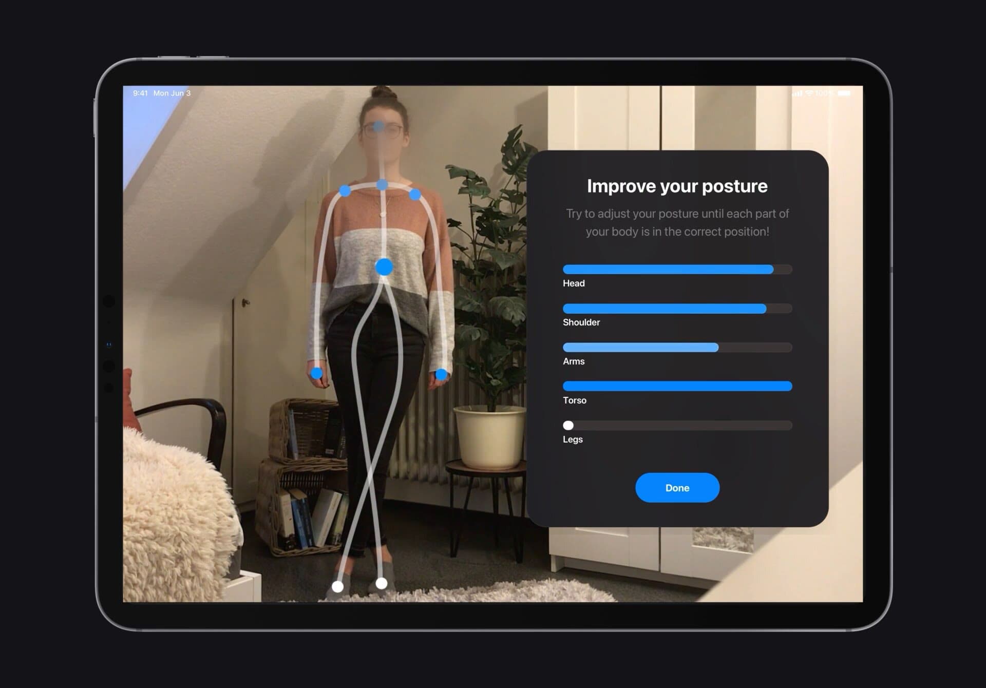
Stand the tablet in front of you so it can see all of you. The camera reads your posture in real time and maps correction onto you in augmented reality — a prompt with a live correction rather than a verdict afterwards.
Two findings shaped it. Thin lines are almost invisible in AR, so it borrowed the heavier line weight from the dynamics exercise. And because iteration 1 had already established that people won't watch themselves, the camera image is abstracted down to a skeleton — all the information, none of the discomfort.
The design question we never fully settled: whether to show the user what's wrong, or what right would look like.
Gestures
Designed, tested, and left as the one that got away.
Gestures reinforce what's said, so the exercise had you imitate a good gesturer to build a repertoire before finding your own style. The interaction was lifted from karaoke: mark in the text where the next gesture belongs, and run a timer on the one after it so you know when it's due.
Testing was blunt about it. Following text that moves is hard; splitting attention across a video, illustrated gestures and a script is harder; and turquoise carrying two meanings at once — progress and gesture position — read as neither.
The findings survived and went straight into the dynamics and posture exercises. The exercise itself did not get finished.
Design language
Near-black, one royal blue, and a serif reserved for the one place people actually read.
Dark, like a teleprompter
Lower-contrast elements melt into the background so the eye stays on the words, and it's easier on the eyes over a long read. The choice followed the exercises rather than preceding them — they had been designed dark, so the shell had to be.
Royal blue, once
One neutral but unmistakable accent. An earlier journey screen used colour freely and had to be pulled back: it double-coded meaning and read as loud.
Two typefaces
San Francisco across the interface. In the teleprompter-style exercises, a serif with a large x-height instead — it reads considerably better in running text, which is the only place in the app with any.
A fox, not a mascot
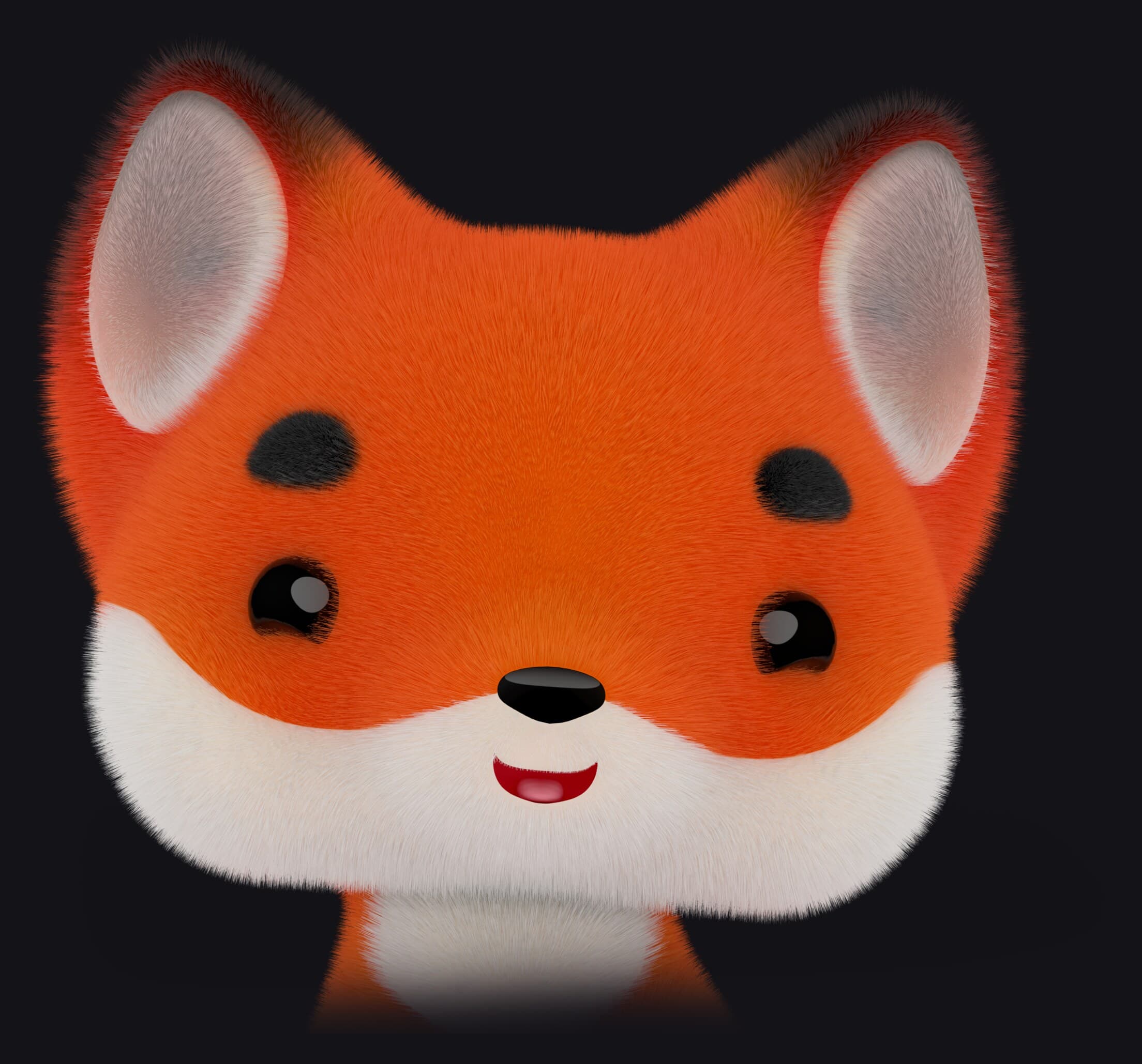
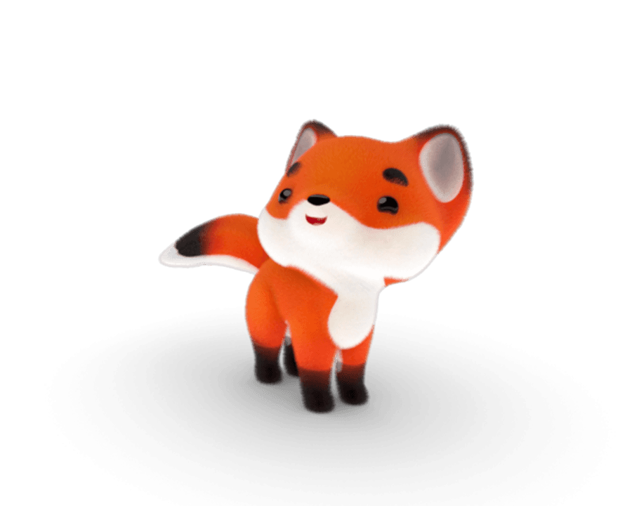
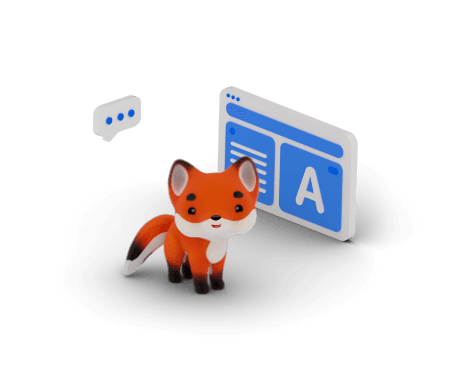
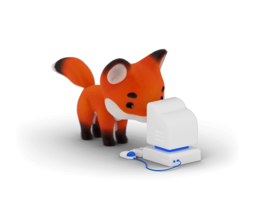
The hero carries the progress model rather than decorating it. Built in Cinema 4D and animated in After Effects, along with the plateaus and the whole illustration set.

What we cut
Four directions, and the pieces inside the fifth
The conflict chatbot
Guided reflection worked. Asking people to film themselves saying it out loud did not, and nothing carried them from the rehearsal into the real conversation.
Animoji as a mask
Anonymity genuinely loosened people up. It also took micro-expressions and body language with it — the two things a communication tool can least afford to lose.
Improv behind a mask
The exercises built confidence. Nobody understood the instructions, or why they were wearing a face that wasn't theirs.
The Working Out Loud circle
A weekly group session, moderated by the software. The audience had no appetite for a fixed weekly slot, and no shared exercise served goals that differed for everyone.
And inside the build
- A dedicated profile section. Progress ended up distributed through the app instead.
- The spider diagram in the self-assessment — values hard to read, categories impossible to compare. It became a bar chart.
- The bright colour treatment of the Journey screen, which double-coded meaning and read as loud.
Listing them isn't modesty. The route is the argument: presenting only became the subject because four broader attempts each returned a reason it couldn't be. A case study that shows only the parts that worked isn't a case study.
Outcome
An iPad coaching concept with a complete UI system, five exercise types, a gamified progress model and animated prototypes — four months of research and four abandoned directions behind it.
The lesson the team wrote down at the end was about scope: define the problem precisely and cut it small from the beginning. And, in their own words, be ready to kill your darlings — then wonderful things can happen.
- Design & research
- Fabian Schadt, Annika Schiefer, Joshua Dessol
- Supervisors
- Prof. Hans Krämer, Prof. Jens Döring
- Expert interviews
- Ludwig Kannicht, psychologist and founder
- Built with
- Figma, Principle, Cinema 4D, After Effects, Miro
Images and films come from the original project documentation, which was written and submitted in German. Everything was researched, designed and tested remotely — it was winter 2020.